 There you are, face to face with that attractive person you want to date, or maybe it’s a potential boss, and you want to impress. This is your big opportunity.
What do you say?
Would you say, “Hi, I’m the leading provider in world-class solutions blah blah blah?” I doubt it. The person would more than likely walk away.
The home page of your website is that same opportunity as a chance face-to-face meeting. It’s your time to shine and to impress the person you’ve been courting. In five seconds or less.
Of course, you want to optimize your home page to charm them with good, clean design (i.e. your good looks), but what you say matters most – call me biased, I’m a communicator. You only have a few seconds to make that great first impression.
What do you do with that time?
Sweep them off their feet by showing them how you are going to make their life better. One sentence. Distill your corporate story down to one sentence. Don’t worry – they’ll get more later. But we need to hook them before they look away.
Here are a few great examples:
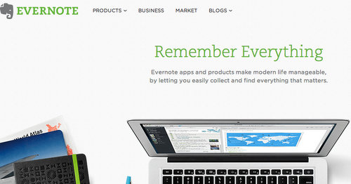
- Evernote: Remember Everything. Evernote apps and products make modern life manageable by letting you easily collect and find everything that matters.
- Vocus: Marketing can be hard. Vocus makes it easy.
- Clarity is your lifeline that instantly connects you with battle-tested advice from entrepreneurs. Find and schedule a call in minutes.
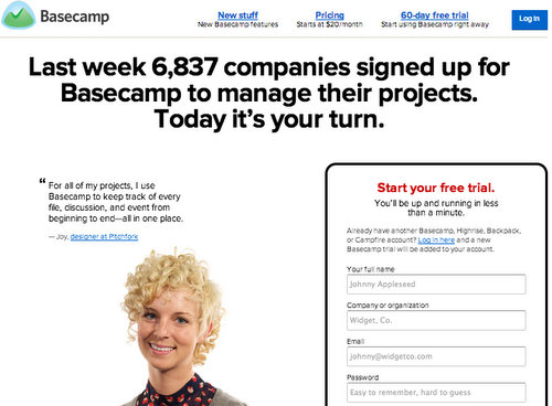
- Basecamp: Last week 6,837 companies signed up for Basecamp to manage their projects. Today it’s your turn.
What do these pages have in common?
Each of them talks about how they are going to solve my problem. Help me remember everything; Make marketing easier; throw me an entrepreneurial lifeline; help me manage my projects.
Each page shows empathy for me and my problem. I don’t care yet how long they’ve been in business and I won’t believe them if they tell me they are the “leading” something or other until I see it for myself. All I want to know is, can you help solve my problem?
Let’s break that down.
A one sentence story will include:
- The protagonist: Your customer is the hero of the story. Who is it?
- The conflict: What is the problem? It’s hard to remember everything. Marketing is hard. Being an entrepreneur is like going to battle.
- What’s at stake? How you solve it or what if you don’t: Managing life, making marketing easier, saving my business, managing my projects.
The fewer distractions, the more focused they become, the more attention you get.
When you first meet the girl or boy of your dreams, you don’t launch immediately into your life story then strip down naked, right? Why would you give up everything on your home page?
Give your prospects enough to know you’re here to help, and show them how they can find out more. Resist the temptation to feel like you have to bombard them with everything at once. If they have too many distractions, you lose control of that customer, and you lose the sale.
Take them by the hand and show them next steps.
Where should they go next?
This is where your user experience team plays a big role. You’ll want to map out the various paths your buyer personas will take but we won’t get into that here. From a story telling perspective, give them an option to learn more, or to sign up for something. Start shopping now, find the product or service that is right for you, try a free demo now.
A simple navigation makes it easy for those who are curious to learn things like how it works, and how much it costs, but even more prominent is the call to action – often two options one further down the sales funnel than the other. A: Try a free demo, browse or search, learn more; or further along the sales funnel B: Book now, login, buy now, or call now.
Everyone loves some social proof.
Basecamp loves to make you feel included. We don’t want to feel like we’re your guinea pigs and it’s a great way to show you are a “leading provider” rather than say it. “this many companies or people have <insert outcome you provide here> now it’s your turn.” They show that happy/relieved person with a quote from her. You want to be her.
Just like the Corona ads of the beach chairs in the Caribbean. Make your prospects want to be there; make them want more.
It doesn’t matter if you are an online business, a hotel, a store, or a B2B corporation, your home page should do a good job at wooing that first time visitor into clicking for more. Don’t scare them away by giving up everything in the first few minutes. Show them enough to want to go on that second date and if they are right for you, they will eventually commit.
This is a slightly modified version of a post I originally wrote for Vocus.
Photo Credit: ArloMagicMan via Compfight cc
[ssba]

Если ищете актуальные данные, можно скачать базу для xrumer https://www.olx.ua/d/uk/obyavlenie/progon-hrumerom-dr-50-po-ahrefs-uvelichu-reyting-domena-IDXnHrG.html и проверить её качество.